Wednesday, August 16, 2017

NINJAS and ROBOTS are Coming!!!

NINJAS AND ROBOTS ARE COMING!!


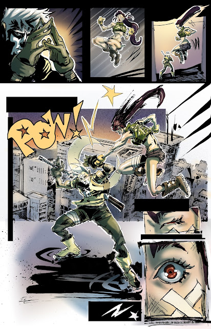
Hey guys!  Long time no see, hope everyone is well.  Update:  the Ninjas and Robots Kickstarter is LIVE and at this point there is roughly 3 DAYS LEFT in the game.  

For those of you who just happened to stumble on this, Ninjas and Robots has been a project in the works for a long time.  It has had another name, but much of the elements and characters have stayed the same.  It's taken me awhile to work out what it should be... and it's still being worked out.  This first book, Ninjas and Robots, a graphic novel, is hopefully just the beginning.

The Kickstarter has done really well.  The graphic novel itself was awarded a Grant for black and white publishing, but after spending a great deal of time working on the project, I really felt like it was something that would best be expressed in color.  Hence the Kickstarter.  The Kickstarter's main purpose was to enable the project to be printed in color.   The Kickstarter's secondary purpose was to offer a single convenient place for people who were interested, to PRE-ORDER the graphic novel.  And to make it more fun, there will also be an Art of Ninjas and Robots Book, a Kickstarter exclusive T-shirt, and some other fun stuff and goodies.  


There are sample pages up and more project info is available there.  

Get READY!!!


E & KATY


Wednesday, September 7, 2016

ON PROCESS... DEADPOOL VS RAPHAEL

The process of comicking is an ever changing one.  As we grow as artists we pick up new things and we let others go, and sometimes we go back to them later on and start the cycle all over again.

This is more or less what my process is looking like today.  This was a commission I just did of Raph and Deadpool clashing swords and sais.

ROUGH IN RED PENCIL
I'm using a red lead holder because it's easy for me to see and different enough from the black line I'm going to put down with ink that I don't get confused.  If I was going to go to final inks on this I would probably do a light blue underdrawing, because it's less distracting, and the original art page wouldn't look like such a mess when I'm finished.

DRAWING IN INK OVER ROUGH WITH AN ARTPEN
The Artpen is way more fluid than my G-pen, so it's still a really loose drawing. This is still my rough underdrawing, I'm just making some choices and finalizing some lines.  This is the equivalent to my "finished pencils".  


LIGHT TABLE FINAL LINE ART WITH A G-PEN
Then I use a light table and put my clean final art board over top of the Artpen rough, at this point I try to go slower and make more calculated choices with the G-pen.  I use the titanium G nibs and either Eon Vortex Ink or Deleter 4 Ink.  I use the Eon and the Deleter ink, because those are the only 2 that I've found that don't reactivate when you add water or alcohol.


COLORS WITH WATERCOLOR, AND FINAL BLACKS WITH A BRUSH-PEN

I do the colors before doing any blacks because I use cheaper ink to fill in the blacks, and it reactivates if water touches it making it bleed.  Right now I have Noodler's "The Heart of Darkness" in my brush-pen... it's super black and it's supposed to be waterproof and bulletproof but it's NOT.  It totally reactivates and bleeds ... which could be a cool effect if it's intentional, but it could also be very bad if you weren't expecting it.

At this point I'll just add some more variety of value, pushing some of the lights and darks, add some more rendering here and there and doing some clean-up with white.  And then BOOM, off to the Post Office and dropping this bad boy into the mail.

Hope this was fun to see and answered some questions.

If you have any other questions about tools or comicking or my process ask away in the comments and I'll try to do a post to answer them.

Best!

@interstateninja

*POOF*


KUBERT SCHOOL GRADUATION & MULTIVERSITY COMICS

Man, is it SEPTEMBER already?!?  ... and 2016 too!!!

It's been a super long time since I posted anything about comics or art, that doesn't mean I haven't been drawing... I've been drawing... A LOT!!

I wrapped up my time at the Kubert School back in May.  3 years and thousands of drawings later... I graduated with all my super cool 3rd year Kubie peeps.  We had a rad dinner with a small ceremony and my wife and son drove up for the festivities.  It was a good time.  Very challenging, but totally worth it.

The first part of 2016 was all in preparation for graduation, getting assignments done, getting the portfolio ready, meeting with tons of Comics publishers, editors and professionals.  We met with Marvel, Aftershock, and Valiant (to name a few), and I sent stuff to IDW and Udon.  I should probably do a post just about Portfolio reviews and meetings and submissions... it's pretty interesting stuff.  I also did a ton of sketch-parties at a bunch of comic book stores, and several cons and numerous shows and events... a special shout out to ZAPP COMICS in Wayne, NJ for being the best comic book store in the U.S.!!!

This summer, after finishing school and clearing out and cleaning up the "the Mansion" (one of the Kubert Student Housing locations- I was one of the RA's for the second half of the school year) I moved back down from New Jersey to North Carolina, and once in NC I moved from one house to another.

But now, School is back in session, and with my kid out the door early, I'm finding more and more time to draw again.

So here is something cool... I got a small feature on the Multiversity Comics Website.  I did a Supergirl illustration for them and the art will be auctioned off for a kid's Charity at a later date.  I'll keep you posted about that.

Check out the awesome write up, here >>> 40 Days of Supergirl: Erik Klaus

Without further ado... Here is Supergirl:

SUPERGIRL by Erik Klaus.  Ink and watercolor on bristol. 


More updates coming SOON!

*POOF*

Friday, August 21, 2015

X-23 SKETCH-OFF!!!

So my buddy Xavi asked about contributing to a little sketch blog he cooked up.  A bunch of the guys decided to bang out some X-23 and then we would all post the drawings on the same day.

I've never drawn X-23 before, nor am I that familiar with the character, but a female clone of wolverine that may or may-not hang out with my favorite female ninja Psylocke... sounds pretty awesome.

First off, I don't really do the pin-up thing.  That's just me.  Females in unnaturally contorted poses, just for posing sake, is not something I do, unless it's from life, or a study of some kind.  I want to see action, unless I am studying anatomy.  Why action heroes need to pose in static makes no sense.  You can have action, or movement, or energy and still be aesthetically appealing.  Swimsuit models aren't girls who model swimsuits, they are swimsuits that model girls.  What's selling, the suit, or the figure?

I see a lot of amazing artists who really grasp line energy and anatomy getting stuck in that pin-up girl pose thing.  Just walk around Comic Con the prints that sell well are usually those, and they are everywhere.  It's almost like a dating service, you walk around and look for the features you prefer, and hang them on your wall.  The next level from that is taking cool figures and giving them some natural looking movement.  And the next level after that is not only giving them natural movement but doing some kind of storytelling in the process.  And really that's what this is all about.  Storytelling.  You want to know the characters by looking at them.  What they think, how they feel at that moment, what they stand for.  It's like a snapshot of someones life.  The best pictures usually have stories that go along with them.  They have something deeper.

Anyway that's kind of how I think.  I haven't arrived at that level of awesomeness yet, but that's what I'm going for.

X-23 PENCILS
So I scribbled out a pose that was walking.  A mid-air shot might have been cooler, but I wasn't trying to copy this Sanford Greene print I have hanging up in my studio.  I like the way he drew X-23 a lot in that print, in fact that's really the only exposure I had to her before trying to draw this.  His Psylocke in that piece is pretty rad too.

My pencils are pretty loose but I got most of the information I needed from them.

X-23 INKS
I could've tightened up the pencils more, but I didn't have a lot of time for this, so I jumped into the line art.

X-23 COLORS
I threw some copic color and some watercolors down to flesh out some of the colors a bit and get a feel for how I may want to tackle it.

X-23 INKS AND COLORS
Then I pushed some of the color levels and added some blacks with a brush.  I added some red in the background with watercolor to pop the figure a little more.  

X-23 AND A ROBOT
It was just a sketch in my sketchbook (you can see where I was testing the colors and inks on the left) but it was good practice.  

X-23 FINAL
This was the final image, I leveled it a bit so the blacks were more black.  I don't have a scanner right now, so I just took a photo using my phone.  

And that's pretty much that.  Check out the other awesome sketches the guys did on our other blog.


*poof*

Sunday, August 2, 2015

CREATING COMICS 102

Welcome back TEAM KIRE(Key-ray).  Kire is Erik spelled backwards.  :D

So this is a glimpse into the process that creates DRACO AT WAR, this time we'll be looking at PG 4.

I started with the script.  Based on the script I did a thumbnail in a notebook.  I originally thought I would do 3 panels, 1) a wide shot, 2) a close-up and 3) a medium close-up.

ORIGINAL THUMBNAIL
If you look on the right side of my thumbnail, there are three horizontal panels, the 1st says 1/2, the 2nd says Z F TH, and the 3rd says M R S.  Those are the initials of the characters.  The 1st panel I intended to take up 1/2 the page, and then stack the other 2 underneath, showing the 6 characters 3 at a time and getting a feel for who they are and what they may be like.   Kind of like an introduction.   I thought it would be more dynamic that way.

 Then I started to do some full sized roughs.

1ST FULL SIZE ROUGH
It occurred to me that in the 2nd panel I could still do a close up, but this time of Finn (F) and show Zayden (Z) and Thrash (TH) behind him.  I thought that would add depth and still qualify for the needed page close-up.  (As a general rule of thumb you ought to shoot for at least one close-up and one wide-shot per page… it's not required, but it's a good rule if you need help.)  So I have my wide-shot and my close-up, with characters on either side of Finn… I thought of breaking the panel with Finn, because he's so big.  If you break panels, make it a full break.  Don't half heartedly break them, or it will look like a mistake or a tangent.

2ND FULL SIZE ROUGH (PANEL CORRECTION)
It seemed a little redundant to have everyone doing their thing, as described in the script, and then show them all again, but with a closer view.  So I thought for the 1st panel I'd have Zayden say his line, he was going to wait until panel 2, and I thought I'd show Finn in the BG.  That seemed cool to me, so I roughed it out on good paper.

1ST ROUGH ON BRISTOL BOARD
As you can see though, Finn is too large to fit in the 1st panel and still fit with the perspective, so even though he had a cool pose, he had to go.  :(  I also changed panel 2 to give him a super close-up, because he's so cool, and also because you saw him clearly on the page right before this one, so you don't need to see him that well all the time.  His eyes and hair are enough for this page.

1ST PANEL PENCILS
The first panel pencils ended up looking like this.  You can see the 2H (lighter) lead underneath and the HB (darker) lines on top. I tried to get the faces pretty tight before I started inking them.

Let's do some inking!

INKS
I had the figures pretty much how I wanted them so I started inking.  School Pen Nib and Eon Vortex Ink.

TRYING TO GET THOSE FACES RIGHT
After inking the figures in the 1st panel, I inked Finn in the second, and then I worked on tightening up the other figures on the page.  I had a speech balloon over Zayden's head in the 2nd panel (he's the figure sitting on the pipe) but it was too close to his head so I thought about putting it on the left of Thrash (the guy with the sword).  And Rune's face (the guy with a gun) was giving me so much grief!! He has so many upgrades and modifications there isn't much flesh left to draw.  So his face, especially, is a little tricky.

TWEAKING
 So here I tweaked Zayden's posture in the second panel, I had him hunch over more, which left room for the speech balloon over his head.  I didn't want the speech balloon on the left of Thrash because there is a balloon right above that.  So this way the Balloons go from far left, to middle, to far right, as you read the page.  It's a smoother transition I think.  I also played with Rune's face some more, I felt like I needed to draw his right eye through the lens so I could get the positioning of everything better, otherwise the super-scope over his eye was floating around and going in the wrong places.

INKS W.I.P. 
And these are kind of how the inks are going.  I still have a lot more to do, but I was playing with a more graphic black and white, deep-space feel.  I still have to do the BG's in panels 2 and 3.

So, yep, stay tuned.

*poof*
Monday, July 27, 2015

CREATING COMICS 101

What's up guys.  Hope the summer has been treating you well.  Full sized layouts (roughs) for many Draco At War pages have been done, and final pencils and some inking have begun.

I had some time to meditate on where I've been (having my storyboards reviewed at SDCC in 2011), and where I've come (Going into my 3rd year at the Kubert School).  It's been an interesting ride.

But let's get on with this update:

PENCILS FOR PG 3 PANEL 2
I posted the full sized roughs on tracing paper I did for this page awhile back.  You can see how the pencils changed from that stiffness and became more alive.  The rough was just so I would know how to place things, where they would fit on the page and roughly what size the final images would be.

Basically what I do is re-rough over the old rough onto good paper using a lightbox.  At this point the only think I'm thinking about is proportions, are they pretty accurate.  I take pictures of myself posing using Photo Booth on my laptop.  Sometimes when we are drawing and not checking what we are doing, heads get too small, ears get put in the wrong place, arms get too long, or are different lengths on the same figure.  I want to avoid as much of that as possible.  I use a 2H lead holder for this first pass.  The lead is harder so the lines I draw are lighter.

Then I'll start tightening up the pencils, tweaking anatomy and I'll try to make figures and faces look cool.  I'll also start adding details and start thinking about how I am going to ink it.  I do that with an HB lead holder.  The lead is softer so the lines I draw are darker.

INKS FOR PG 3 PANEL 2
When I have the pencils pretty much how I want them, I re-draw the image, but this time with ink.  Inking is not tracing.  It's drawing.  I try to have small quick confident lines, not slow, weak, wobbly lines.  Don't be afraid of ink.  It's not permanent, you can always use white paint to erase.

My line work was done with a Tachikawa School Pen nib and Eon Vortex Ink.  I like the school pen, it's a Japanese nib that gives pretty good thick to thin, and yet is firm enough to not go too nuts if I press too hard.  I have tons of nibs for my nib holder, but that one is just the one that's in there right now, and it doesn't clog up too much, so I'm cool with it.  There is nothing worse than dropping a line and having your nib dry up… the odds of you dropping that same exact line are few to none.  I can get tons of lines out of one dip with the school pen.

I use the Eon Vortex ink because it's waterproof and copic proof and it doesn't smear or bleed when dry.  It's amazing.  I've tested a lot of inks.  I've made test pages with tons of lines from lots of different inks, and then smeared copics or watercolors over them, and I've measured how much each one bleeds.  They all bleed to some degree, all the ones I've tried, except Eon Vortex.  Try it yourself and see.  We are always looking for top materials.  The Eon Vortex ink is also a matte black which means it has no gloss, which is also good for scanning.  Sometimes the gloss of other inks reflects light more when you scan.  The trick here is not to mix inks on your page though.  I picked up my pocket brush a few times and then remembered it had rapidograph ink in it, which is glossy.  oops.

For the heavier black spots I'm using a Raphael #2 brush and dipping it in the Eon ink.

PAGE  3 W.I.P.
This is a peek at the W.I.P.  for page 3.  It still needs more ink and white paint, but this is all part of the process.  Drawing comics is a process.  One of my buddies said you gotta love the process, not just the finished product, or you are in the wrong line of work.  As comic book artists we spend more time "in the process" than anything.  So we gotta love that place where we get ink and sweat on the mat, the mat being the paper.  I'm mixing up martial arts and comic analogies here.  But you get the idea.

For the white out i'm using a Sharpie paint pen, and I have some Deleter white 2 for larger paint spots.  For smaller details I'm using a Koh-i-noor .35 rapidograph pen and for technical stuff, where circle guides are needed, I use a copic multiliner 0.5.  They don't bleed under the tools like a nib does.  I also use a 0.8 copic multiliner for the panel borders.  

THESE ARE ALL THE TOOLS USED THUS FAR FOR THIS PAGE (RULER NOT SHOWN)

And Boom!  there you have it.  UPDATE COMPLETE.

See you soon!

*poof*


Thursday, June 4, 2015

working things out.

Much of comic booking is problem solving.  You are looking for creative ways to solve a puzzle.  When you get to the art part you are trying to figure out the puzzle presented by the writer.  The writer had to problem solve their way through the script or story or plot before the art part even starts.

Right now much of what I am doing is going through the script, trying to understand the characters, and  decide how to break each page into panels.  There is no absolute way of drawing comics, everyone should problem solve in their own creative, individual, way.  But there are some points to keep in mind that will kind of keep you on the right path.  Ideally I want to have at least one wide-shot and one close-up on each page.  The wide-shot tells the reader where the characters are, or location, who is in the scene, and gives feeling and context to the other panels.  The close-up lets the reader get close and really enter into the story, to feel what a character may be feeling or to see certain necessary details or props.  As you get to know people better you get physically closer and closer, you don't stay on the other side of the room while they are talking.  You enter into the room and walk closer.  And then of course you have lots of different shots and angles in-between or around the wide-shot and the close-up.  Ideally I want to lead the readers' eye through the page and have them stop on things I feel are important and encourage them to turn page after page until they get to the end of the story.

There are a lot of things to think about, which is why much of this is problem solving, but problem solving and puzzles are fun… that's why we love to play Professor Layton games.  :)

full sized Draco At War rough
So this is a full size "rough" from the script.  Basically I thumb-nailed out the panel breakdown for this page in my sketchbook, and then I worked out the layout full-size, on 11x17 copy paper,  using blue and red pencils until I more or less had the panels and figures where I wanted them.  And then I tightened up those figures by placing a piece of tracing paper over the full size blue and red pencil scribbles and drew some more ink-like lines with a wooden pencil.  And this is what I ended up with.

This is not what the final pencils or inks will look like, this is still more or less a rough.  It's tighter than most of the roughs I normally do, but I want to make sure it's readable and that I have the information I need before I go to the next step.  In the fourth panel I need to shrink the size of the figures more or at the very least move them down and to the right.  Finn's head is way too close to the top of the panel.  I noticed that when I stood up and got further away from the board.   But again this is just a rough so it's easy to change.  What I'll do next is take this rough and transfer it to bristol board, the final good paper, using a light box, in order to get ready for finished pencils and inks.

The "rough" above is not exactly what was presented in the script.  But not only am I looking for a variety of camera zoom-ins and zoom-outs, as well as movements, I am also keeping in mind the flow of dialogue and how easy that dialogue is to read as it is laid out in the panels.  The page design is a blend of words and drawings to tell a story.  The story needs to be clear enough to read through drawing and action that you don't need words, but the words offer more depth and insight and detail… and ultimately become "part of" the art.

Another thing I have to keep in mind is character design and presentation.  The characters appear again and again and again, panel after panel as the story is acted out.  So the characters have to be recognizable and consistent.  Their silhouettes should differ from one another so that even if there is no rendering detail we should know who is who based on size and shape and posture.  Plus, they need to look interesting.  Because of that I am always playing with sketches and scribbles of the characters in an attempt to get to know them better.  I need to know the way the look from every angle and I need to understand their expressions and gestures and their history so I know why they do and say the things they do… understanding that their actions may contradict their words.

Finn study done in watercolor
It's all a process of layering.  You build on what was before, adding and adding until you get to the end product.

I'm trying to get six full process, full color, pages done by the end of the month.

Check back for details and updates on Draco At War.

-Erik